Color is a powerful thing. It can set the tone of a room, impact our emotions, and draw our attention. To branding experts and designers, color is one of the most important tools at their disposal. If you’re a designer, you must know how to use color to enhance your imagery and to win the correct responses from your audience.
This post will go over some basic color theory to help give you a foundational understanding of how color is used in web design, branding, and how it can affect human behavior.
The Color Wheel & Color Schemes
The basics of color theory begins with the color wheel, a circle comprised of different colored sections to represent the relationship between colors. These sections include primary, secondary, and tertiary colors.
A designer can then take several of these colors and arrange them to create a color scheme that will serve as a foundational part of a business’s brand. There are 5 different color scheme models that most designers use.
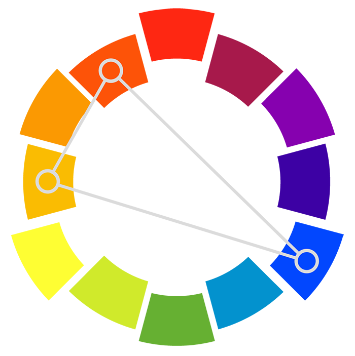
Triadic
A triadic color scheme uses colors that are evenly spaced around the color wheel. This scheme is typically vibrant and diverse but maintains balance.


Complementary
A complementary color scheme uses colors that are directly opposite of one another on the color wheel. This scheme is commonly used for its contrast, especially when using a cool and warm color. They are particularly great for call-to-actions on a website or other standout elements since they are meant to draw attention.
Compound (Split Complementary)
A compound color scheme is comprised of 2 contrasting and 2 complementary pairs. This scheme is a step above the complementary color scheme because of its complexity. It still draws attention but has more depth and interest.
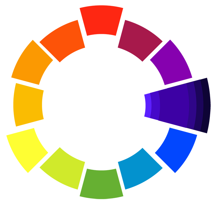
Monochrome
A monochrome color scheme is developed by adding tint (adding white) and shade (adding black) to one color. Monochromatic colors are pleasing to the eye, but tend to have a blending effect that fails to grab attention or stand out.
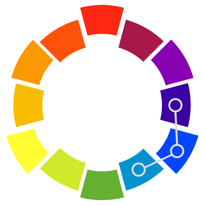
Analogous
An analogous color scheme contains three colors next to one another on the color wheel. This color combination is known for its cohesiveness while still grabbing more attention than monochromatic colors.
Color Psychology
Color psychology is the study of how hues can determine human behavior. As you can imagine, knowing how people will react to certain color schemes can be very helpful when designing for a brand or with a specific intention. In these cases, we have to think about how these colors may affect the viewer and perception of the brand.
Red

Red implies vibrancy, passion, love, power, aggression, and danger. Since it is so bright, red attracts the most attention, which is why it is commonly used for warnings and important notices on labels and signs. However, the meaning can change depending on what you pair it with. For example, when paired with white, red represents passion. This explains why we often see Cupid in red and white colors. When paired with black, however, red appears more aggressive. While color can affect human emotion, it can also affect us physically. In fact, studies have shown red to raise blood pressure and respiration rates.
Orange

Orange implies warmth, energy, and fun. Since it is less harsh than red, but still stands out, orange is used on most road signs and notices. This is a great color to give off a warm, energetic tone. Orange also has a strong association with autumn and Halloween.
Yellow

Yellow is the most visible color on the spectrum. It represents warmth, the sun, happiness, and even antiquity and timelessness in darker shades. It is a very eye-catching color but it can also strain the eyes when at its brightest, making it difficult to look at for too long.
Blue

Blue implies sadness, cleansing, refreshment, and reliability. We most commonly associate the darker shades of blue with sadness, hence “the blues.” Deep blues, however, can be used to represent strength, reliability, and have a more corporate feel. Lighter shades of blue often make us feel relaxed and energized. This is why you commonly see light blues used by spas.
Green

Green is most commonly associated with growth, health, finances, and the environment. In most cases, when someone sees a bright green, they immediately think of money and wealth. However, when paired with browns and blues, green takes on an environmental connotation.
Purple
Purple implies wealth, luxury, and romance. Purple has historically been associated with wealth and royalty. This is because of the extreme cost of purple dye, which was made from rare mollusks in the Mediterranean Sea. Paired with white and pink hues, purple takes on a meaning of romance and intimacy, which is why you see it so much around Valentine’s Day.
White

White is most commonly associated with purity, innocence, and freshness. For this reason, you will see a lot of white used on wedding, healthcare, and spiritual websites. White is also wonderful to use in minimalist designs that rely heavily on negative space.
Black

Black is commonly used to represent strength, sophistication, evil, and the unknown. In the classic tales of “good vs evil,” good is often represented as white and evil as black. Think of the outfits of Darth Vader and Luke Skywalker. Aside from its use in pop culture, black is great to use for a look of professionalism and sophistication.
Helpful Tools
Now you can venture out and put these techniques into action for yourself! But to help you get started, I wanted to share some of my favorite color design tools to make the process easier.
Coolors.co
This is a wonderful website I use to quickly browse and generate color schemes with the touch of a spacebar.
Adobe Color CC
This color scheme generator is a step up from Coolors. This tool is filled with an infinite number of options to customize and generate your very own unique color scheme. You can also browse through hundreds of premade color schemes.
Dribbble
Every design starts with inspiration. Dribbble constantly updates its library with the latest design trends and is sure to get your creative juices flowing.
Happy coloring!