Logo design can be extremely difficult, especially when the direction for the logo is imagery-based. The tricky part is taking a complex 3D object and turning it into a simple, memorable icon. In this tutorial, I’ll show you step-by-step how I designed an animal logo in Adobe Illustrator using a lion as an example. Keep in mind that this technique can be used for pretty much any animal.
Step 1
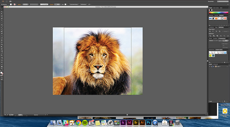
The first thing I do is find a photo of what I want to draw. This photo will act as a basic guide throughout the process. Using a real photo will give you ideas about the form and details of the subject (in this tutorial, a lion) that you probably wouldn’t see if you just started drawing freehand.
Step 2
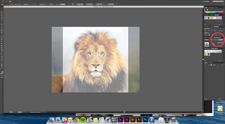
Once you have placed your imagery into your Illustrator file, turn the opacity down to about 50% or lower so it isn’t distracting, it’s just here as a guide.
Step 3
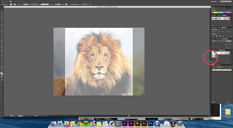
The next small but very important step is to lock your photo layer. This way you can draw and move things on top of it without worrying about it shifting throughout the process.
Step 4
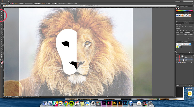
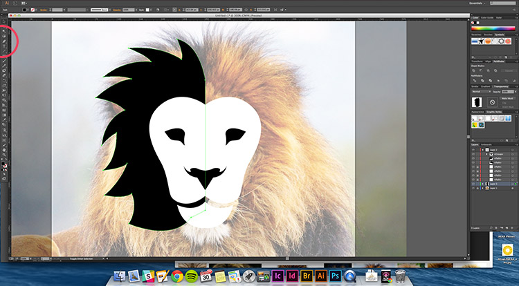
Now we get to the fun part. Start drawing out different features of the lion. In this case, I used the picture as a guide to draw the shape of the lion’s eyes, nose, and head. This is where it might get a little tricky. Don’t try to trace the feature exactly. Instead, try to create smooth simplified shapes.
You will notice I only drew one half of his face. This is because I am going to mirror the elements to ensure a symmetrical design.
Step 5
Next, I moved on to the lion’s hair. This step is where you are going to have to take some creative liberties. I used the lion’s mane as a loose guide for overall shape, but I formed the hair based on curves I felt were pleasing.
Step 6
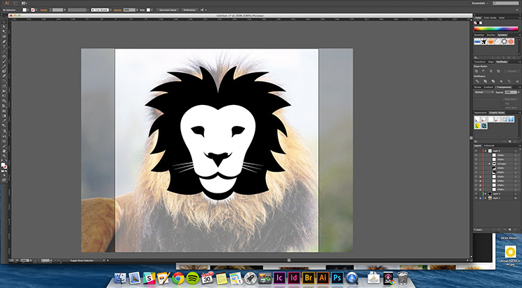
To complete the basic sketch I used the “Object > Mirror” function to flip his face and mane. I also added the small detail of whiskers around his mouth.
Step 7
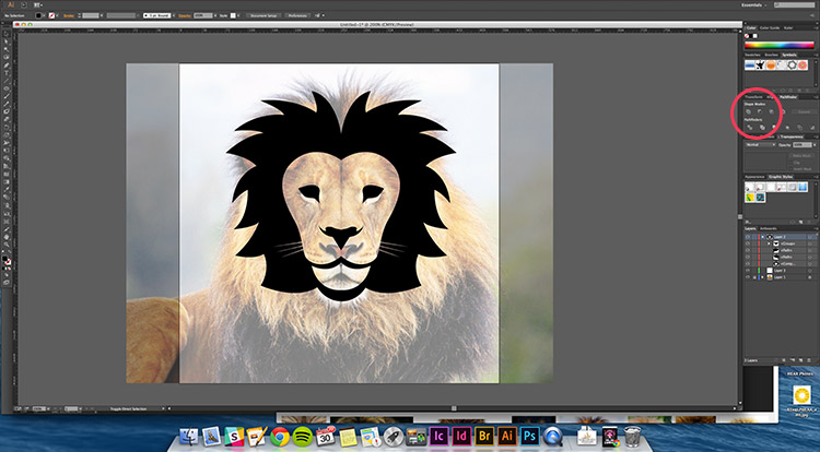
Once the basis of the design was complete I could decide on colors. One option for a very simple graphic would be to use the Shape Builder panel to subtract the white shapes from the black shapes to create a cutout feel.
Step 8
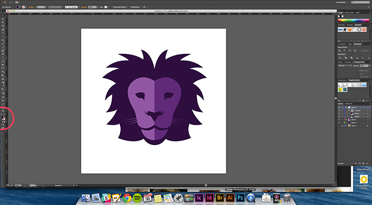
I decided I wanted a little color and a split-tone effect, so I decided to use the 2 sides of the mirrored face and give them some shades of purple. Below is the final look.
I hope this tutorial inspires you to start playing around with Illustrator and see what unique, flat graphics you can come up with!
