Contrary to popular opinion, loud and in-your-face designs actually do not help you convert. In most cases, this type of web design actually distracts and confuses your audience about where to click and causes them to leave the site.
Less is More
The concept of clean design is quite simple. The simpler the design, the easier it is to navigate and take in information. In the case of conversion-based design, less really is more. The more you add to the website, the more likely you are to distract or sidetrack your users. However, keep in mind there is a right and wrong way to do minimal design. Simple doesn’t mean boring. Strong imagery and smart color choices are key components of good, simple design.
The Flat Design Trend
In recent years, flat design has quickly become the industry preference for web-based designs. Gone are the days of rounded, candy-coated buttons and skeuomorphism. The idea behind flat design is that a well-crafted interface, color selection, and simplistic typography creates a beautiful and easy-to-use design. These types of designs make actionable elements clear without being loud and in your face.
Case Study: Air BnB vs. Hotels.com
In this example, I chose two sites that share the same goal: help someone find a place to stay in a new city. I chose one clean and simple site (AirBnB) and a site that has a busier design (hotels.com).
AirBnB
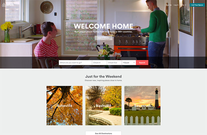
When I first land on this site, I see that I have one main call-to-action: “Where and when do I want to go?”
There are a few other actionable items: “how it works” for new users and options to log in or “list your space” for users that would like to offer their space for overnight stays.
Notice that for the new users the “how it works” button is front and center, but still doesn’t distract from the main action item: “find a place to stay.” Also notice that the log in and listing buttons are discreetly at the top right corner. The designer is assuming these users have been to the site before and know what to do, no need to grab their attention. Just below the main call-to-action is a section for the casual browser. This user may not be sure where they want to go yet, but can skim through a clean and simple list of popular destinations.
Hotels.com
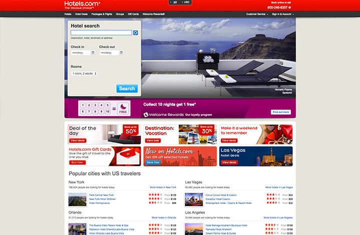
The goal of Hotels.com is similar to that of AirBnb. They want to find out the user’s destination and itinerary. Even though their form is plastered in the banner, the user is immediately distracted by a multitude of other shiny buttons and options. Deals, ratings, and coupons are pulling me away from my initial goal. Like AirBnB, Hotels.com thoughtfully lists some popular destinations for the traveler who hasn’t decided where to go yet.
The difference here is that before I have even picked a destination, they are bombarding me with hotel options, prices, and ratings. One thing at a time, please. The overall impression we are letf with is that Hotels.com gives us plenty of things to click, so lots of options, while looking very busy in the process. It wouldn’t be a stretch to assume most people would have an easier time finding a place on AirBnB.