Charleston Medical Spa
Overview
Charleston Medical Spa (CMS) is an award-winning medical spa that offers personalized medical aesthetic treatments in a relaxing spa environment. The spa’s COO, Lisa Query, came to Barta Media Group asking how we could improve the design and functionality of the e-commerce website. You see, CMS offers an extensive catalog of products and treatments, but customers were having difficulty navigating their site to see all that they had to offer. Lisa also felt the site lacked pizazz and wasn’t doing a good job representing the fantastic results they’re able to give their clients. So, we got straight to work remapping the site’s entire navigation and redesigning every page to make them move visually exciting and engaging.
So Much To Offer, So Little Time
To best utilize space on the Home page, we organized it into six sections.
- Section 1: A fullscreen slider used to promote monthly specials and booking appointments
- Section 2: Eight navigation boxes for each treatment category. Hovering over the boxes reveals the treatments offered within each category.
- Section 3: Recent customer testimonials.
- Section 4: A 50-50 split section with a slider scrolling through best-selling products on the left and a navigation grid on the right to browse products within a particular category.
- Section 5: Instagram feed showing the six most recent posts and links to their various social media profiles.
- Section 6: Three most recent blog posts.
Organizing the Home page into these sections helped us conserve space while allowing users to find the information they’re looking for easily. The Home page also features plenty of eye-catching imagery to keep users engaged as they scroll and navigate.

Navigational Improvements
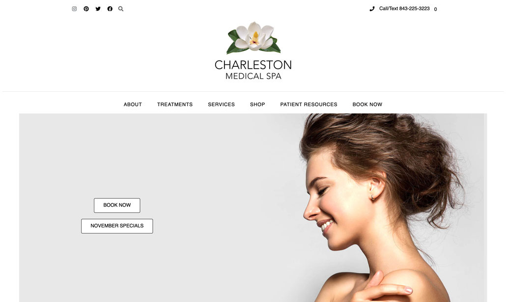
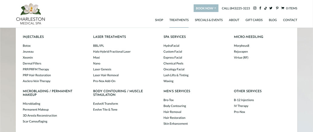
The header navigation menu of the old CMS site had many issues.
- The entire navigation occupied almost a third of the screen on laptops and smartphones.
- Some dropdown menus were also very tall because of how many category names they listed.
- Many category names revealed additional submenus on hover to display different treatments and services.
- The same treatment or service name would appear in multiple submenus, which confused users as to which one they should click.
- The navigation featured separate dropdown menus for TREATMENTS and SERVICES, which added to the confusion.
- The SHOP dropdown consisted of just two links—one for the Shop page and one for the Specials page.
- The BOOK NOW link, which was the most important call-to-actions in their menu, looked just like all the other links. So, it wasn’t standing out like it needed to.
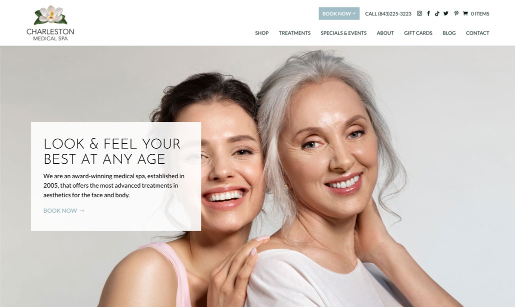
We did several things to improve the organization and overall usefulness of the header navigation.
- Reoriented the menu to take up less space on the screen.
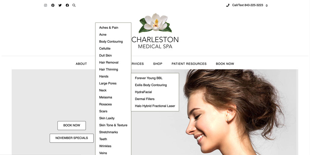
- Removed the SERVICES dropdown menu and turned the TREATMENTS dropdown menu into a mega-dropdown menu.
- Simplified their categorization system so treatments could fall under one of eight categories. We then used the category names as headings within the mega-dropdown menu and listed the appropriate treatments underneath.
- The SHOP dropdown menu was also turned into a mega-dropdown menu to list product brands and categories.
- Created dropdown menus for SPECIALS & EVENTS and ABOUT that use imagery to draw interest and occupy space.
- Highlighted the BOOK NOW link by designing it as a button and positioning it at the top of the navigation.
With the new header navigation, users can find the wide variety of treatments and products CMS offers much more easily than before. They can also quickly spot where to book appointments and find other information about the spa and the current specials.
Treatments Dropdown Menu Before & After
New Shop Dropdown

New About Dropdown


The Full Shopping Experience
When users first land on the Shop page, they are greeted with a fullscreen promotion for the month’s featured product. Scrolling down, they are shown a selection of CMS’s best-selling products. Further down is a carousel of images customers can use to navigate to product category pages. Below that, they can view all the products CMS offers while having the option to refine their search using the product category and brand filters.
Before & After
Charleston Medical Spa now has a website that matches the quality of their services and products. With great improvements to the website’s design and retooling its navigational features, CMS can better serve their online customers while showing them why they are one of Charleston’s premier medical spa.