Anyone in a design-related field knows that the typography you choose can make or break your designs. As web design continues to trend toward minimalism, font choice has become more important than ever. In some cases, the fonts you use can make up half the design. With this in mind, I have outlined the basics of typefaces and how they are styled. This preliminary guide will help you make smart font decisions that enhance the creativity of your designs.
Serif vs. Sans-serif
One of the most basic things to understand when it comes to fonts is the between serif fonts and sans-serif fonts. A serif is the little tail or extension at the tips of a letter. Sans-Serif just means the letters end at a point and do not tail off at the ends.
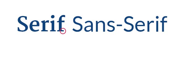
Sans-Serif fonts are generally thought of as more modern, clean, and contemporary. Serif fonts are typically used to project trustworthiness and are often used in print for their high-level readability.
Breaking Down the Elements of a Font
Every font is made up of a set of unique elements. Each of these pieces dictates how the font will look as a whole when they are put together into words and paragraphs.
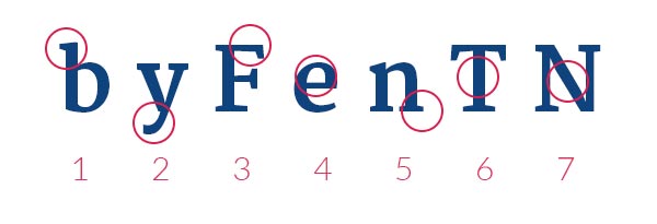
- Ascender: the tall portion of letters such as b and d that dictate the relative height of the font.
- Descender: the downward tail that goes below the font’s baseline.
- Arm: lines that extend horizontally from the stem of a letter.
- Counter: the negative space within a letter.
- Serif: the small extended tails at the tips of a letter.
- Stem: the vertical base of a letter.
- Stroke: the diagonal connectors of a letter.
Fonts vs. Typefaces
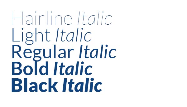
These two words are often used interchangeably, but they mean slightly different things. A font is one variation of a typeface. For example, Lato Light Italic is a font. Below you will see an example of a full typeface.
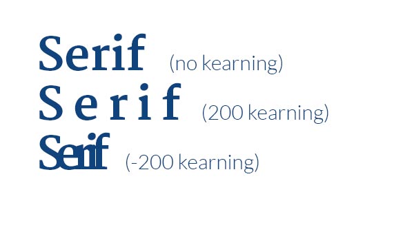
Kearning
Kearning a very handy graphic design tool that simply adds more space between letters in a word. Adjusting the kearning of your type can make an otherwise bland or overused font look brand new!
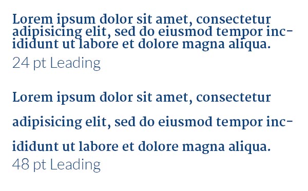
Leading
Leading is simply the number of pixels between rows of text. Adjusting the leading just right in a block of text can drastically increase readability.
These basics on fonts and typefaces should hopefully make it easier to choose and manipulate fonts in your own designs. As your comfort level with fonts improves, try your hand at pairing fonts together and mixing and matching to create an even more striking graphic appearance.
Choosing A Web Font
When it comes to choosing a web font, your best resource is Google Fonts. They have over a thousand fonts to choose from and allow you to preview fonts using specific wording. They’ll even recommend complementarily fonts for headings and paragraph text.