Having a website that provides a fast, intuitive, and informative online experience is a crucial part of maintaining a successful online presence for any business. If it seems like your website is falling short of these three components, it might be time to do some reassessing. This post will cover the top five ways to determine if your website is fit as a fiddle or sick as a dog.
1. It Loads Quickly
Load speed is the amount of time it takes to fully load all of the features that appear on a given page. Since the typical wait-time threshold for most users is 2-3 seconds, it’s important that websites load as quickly as possible.
However, it’s important to note that load speed doesn’t just affect user experience. Google now takes that number into account when determining your site ranking in search results, and having a slow site can affect your ranking negatively.
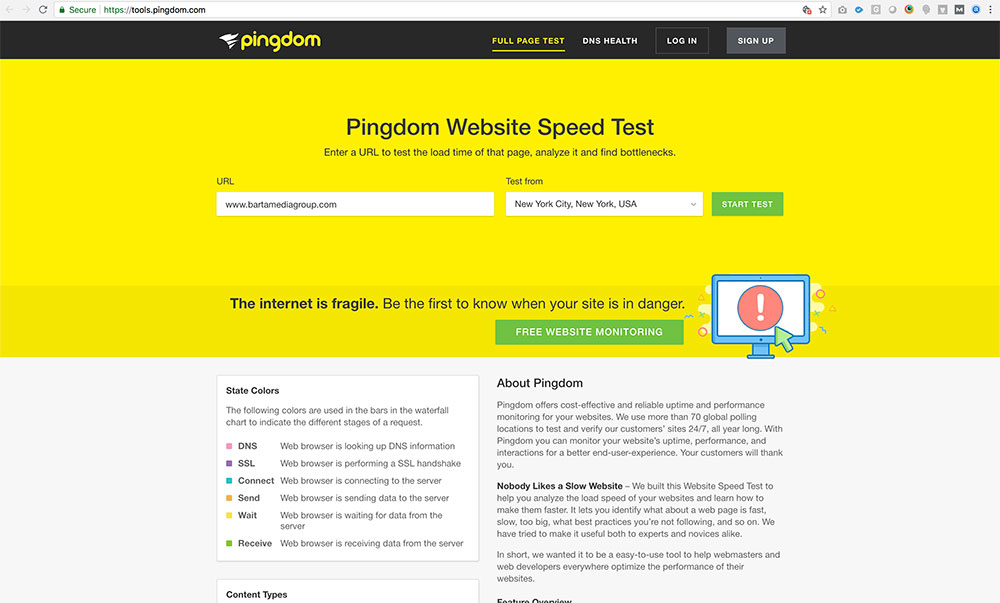
There are several online tools you can use to test your site’s load speed. A favorite of ours is Pingdom. Not only does this tool show your site’s load speed, it also delivers many other helpful insights while giving it an overall performance grade.
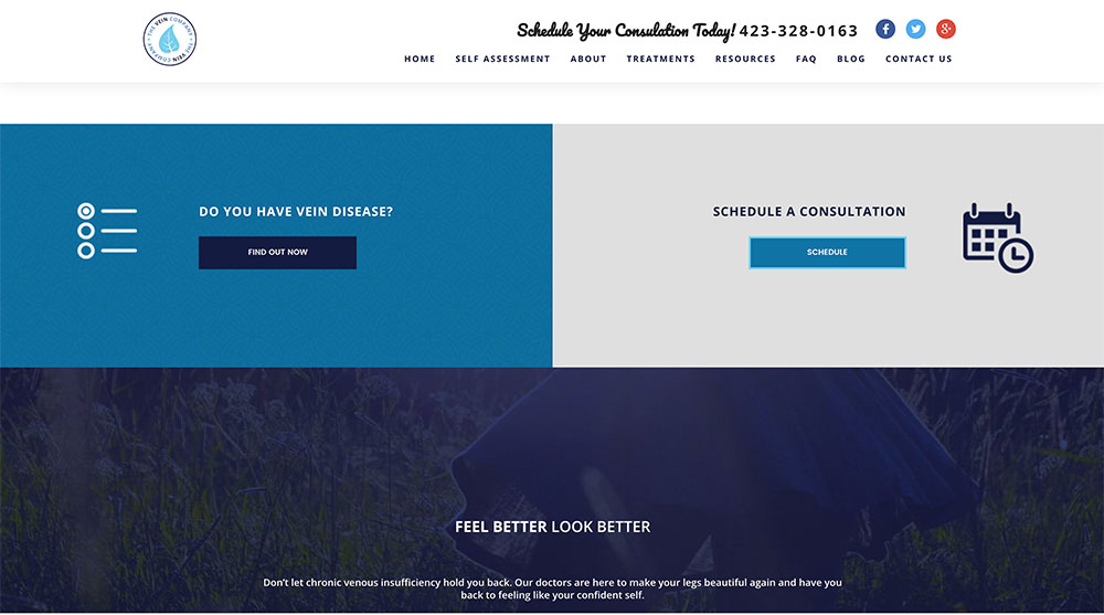
2. It’s Great “Above The Fold”
The phrase “above the fold” originated in the newspaper industry and refers to the top half of a printed newspaper (everything you can see before unfolding the paper). This would be the first thing readers saw before picking it up.
In web design, the phrase has a similar meaning. It refers to all the content that appears on a page before the user scrolls down. This is why it’s sometimes called “above the scroll.” The importance of this section of a page goes hand in hand with your site’s load speed. Users want your site to load quickly, and when it does load, they want to immediately understand what it is you’re offering.
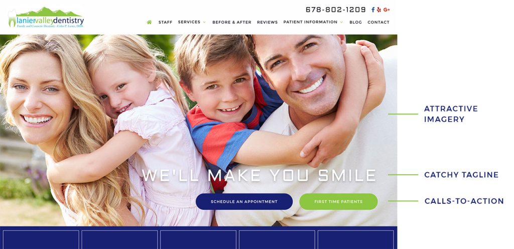
For this section of your site to be its most successful, it needs to have a few key features.
- A large title or tagline that simply describes what your company does.
- A call-to-action to immediately engage and instruct the user to do something. (We’ll cover this feature in more detail later in the post.)
- A pleasant or eye-catching image that grabs the user’s attention and encourages them to explore the site.
With these three key features in place, your website home page off to a fantastic start.
3. It’s Mobile Friendly
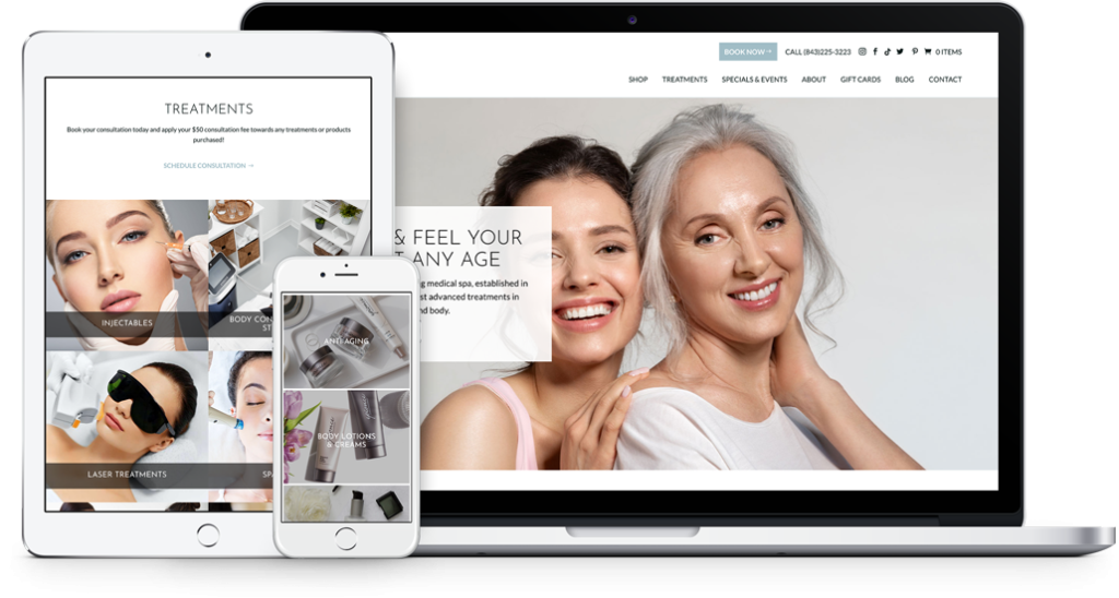
According to Statista, in 2018, 61.2% of users worldwide are expected to access the internet using their mobile devices. This is up from just 48.8% in 2014. As this number continues to trend upward, making your website as mobile friendly as possible should be at the top of your priority list. If your site is not built for mobile (i.e., uses responsive design or a mobile version of the site) or is difficult to navigate on hand-held devices, you’re bound to frustrate a huge portion of your users. Most will likely leave and go to one of your mobile-friendly competitors.
Mobile friendliness is also another huge factor that Google takes into account when ranking your website. So having a non-mobile-friendly site could significantly drop your ranking in the search results.
The best way to test the mobile-friendliness of your site is to periodically visit it from an assortment of mobile devices. Below are some things you should check for:
- Text is easy to read.
- Buttons are easy to find and press.
- Images are sized according to your screen.
- And most importantly, be sure you don’t have to perform the dreaded “pinch-and-zoom” to navigate the site.
A truly mobile-friendly site will expand the full width of a device’s screen and content will automatically adjust for easy viewing.
4. It Uses Effective Call-T0-Actions
Call-to-actions, or CTAs, are one of the primary ways to tell users what they should do and where they should go next while on a page. Most of the time, these come in the form of a button with text explaining the action. Some examples would be: “Schedule an Appointment,” “Contact Us,” or “Sign Up Today.” These are a crucial part of turning your visitors into paying customers. Because while providing information is important, you also want your users to engage and reach out to do business with you. CTAs make that a much easier process.
While you want CTAs that get users to engage with your site, you don’t want them all placed at the top of the page or in just one section. Having too many CTAs above the fold can be overwhelming for a user and stifle their decision making on where to go next. That’s why it’s best to spread them evenly throughout the page. This gives users a chance to interact with multiple CTAs as they navigate your site. Also, some users need a little persuading before they’re ready to take the next step. This is another reason why it’s smart to spread out your CTAs.
5. It Uses Inviting & Concise Content

Consider the first time you picked up a medical textbook and attempted to read it. Probably pretty intimidating at first. When assessing the quality of user experience your site is providing, take note of where you think a user might get intimidated or confused. While it’s important for your content to be professional and informative, it also needs to be friendly and inviting. In the case of a healthcare practice’s website, unfamiliar medical terminology should be avoided as much as possible.
Plainly put, if a user doesn’t understand what you’re saying, they’re less likely to take action. Keep in mind that coming in for a medical checkup can be daunting enough for some people. So make sure the information on your site allows users to easily understand what you’re offering.
A great way to test the clarity of your content is to have someone unfamiliar with your field of practice read it to see how well they understand. Another good rule to follow while writing online content is to write at an 8th-grade reading level. This ensures that your content will be easily understood by anyone who visits your site.
Need Help Improving Your Website?
If after you’ve assessed your website using the 5 steps listed above it seems like your website is falling short in some ways, why not get a professional opinion? Barta Media Group has been helping healthcare practices and other businesses achieve online success for over 10 years. To get in touch with us, give us a call at 678-464-5785 or fill out the contact form below.