Sacred Private HomeCare
Overview
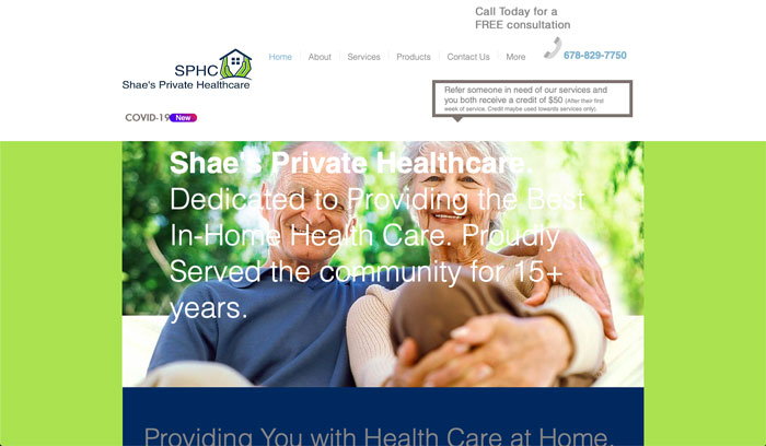
Sacred Private HomeCare (SPHC) offers custom in-home care plans that aim to give their clients the best quality of life possible. Sacred Private HomeCare (formerly Shae’s Private Healthcare) came to Barta Media Group in need of a new logo and color palette for their new company name and a fully redesigned website.
Rebranding
As part of their name change, Sacred Private HomeCare needed a new logo that represented their mission of providing the best personal in-home care possible for their clients. To do this, we chose to use a heart as the logo’s primary icon and an elegant script font that fits neatly within the icon. We also chose deep and soft colors for the brand’s color palette to convey a sense of calm and comfort.
Old Logo | New Logo
Color Pallete


Web Design
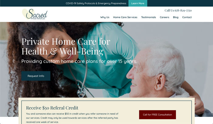
SPHC wanted their new website to target their primary patient population while emphasizing their tailored approach to in-home care. Since the majority of Sacred Private HomeCare’s clients are elderly, the much of imagery we chose for the new site features in-home caregivers tending to senior-age patients. The website also features larger font sizes to make it easier to read as well as plenty of call-to-actions to make it easy for interested users to reach out for more information.
Web Development
Sacred Private HomeCare’s new site was built on WordPress content management system and uses the latest responsive design techniques. This ensures that the site looks great on desktop, tablet, and mobile devices while making content easy to change.

Before & After
With its new logo and website, SPHC is ready to start the next chapter in their business’s history.