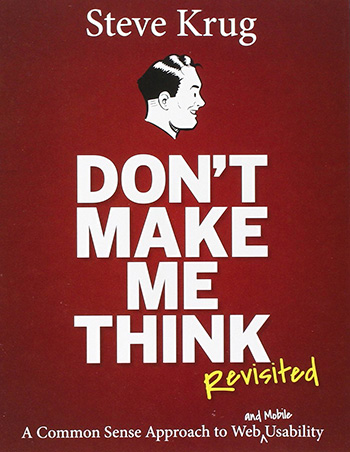
I just finished reading a great book on Usability for the Web called Don’t Make Me Think by Steve Krug. With seemingly millions of books and articles on UX coming out each day, it can be hard to quickly gather some of the key points. Krug’s book was successful at boiling down User Experience so that one person or an entire department can execute it.

Steve Krug has spent over 20 years in the field of UX and information architecture (before people even knew what UX was!) and has worked with some major players such as Apple, Bloomberg.com, Lexus.com, and NPR. He initially wrote the book 10 years ago when UX was just beginning to explode. Since its initial publication, Don’t Make Me Think is on its 3rd edition. Krug notes that the new editions are just to provide more relevant and updated examples, as well as add an additional section on mobile in the most recent edition. The main points are the same as they were 10 years ago, which solidifies the power and longevity behind what he is saying.
Krug defines usability as follows:
“A person of average (or even below average) ability and experience can figure out how to use the thing [i.e., it’s learnable] to accomplish something [effective] without it being more trouble than it’s worth [efficient].” He adds that making the experience delightful and memorable are cherries on top of the proverbial UX sundae.”
After reading the book, I took a chance to reflect on the top 3 things I could take away about UX and applied it to our projects here at Blue Key.
1. Your site is a billboard, not a brochure.

Krug made an excellent observation about how the average user approaches a web page. They scan the page to see if they will be able to find what they are looking for. With this in mind, we have to consider that the user won’t read much of the content at all unless it’s short and sweet; and even then they may not pick through the page to find the link they’re looking for. Imagery, large buttons, and call-to-actions that direct the user into an action can be good ways to capture their short attention span. Use simple and bold design to make your content stand out and be easily read.
2. Even the most basic usability test is better than no test at all.

In the book, Krug addresses a point that has plagued me about UX since college: I want to do usability testing to make better websites, but I am one person with limited resources. How do I do it? The answer is simple. Test in any means possible. It’s not necessary to run a $50,000 test with pre-screened test subjects and all sorts of fancy equipment. That kind of test is great, but not always necessary. You can still gather meaningful data by pulling someone off the street, setting them up in front of your site, and asking them to complete some of the core tasks you want the user to be able to do on your website. This simple watch and learn strategy can be executed over and over with little to no cost and still give you valuable insights into the pain points and successes of your site.
3. Good mobile usability comes from making the best tradeoffs.
When Krug originally wrote this book it was just as the internet was becoming mainstream and the mobile devices of today had yet to emerge. In the newest edition, Don’t Make Me Think, Revisited, he has added a section about using the same long-standing UX principles and applying them to mobile. The key point that struck me was about tradeoffs. There is a constant push and pull between whether losing capabilities is actually user-friendly or not. The answer is that it’s not. BUT at what point does cramming in capabilities hinder the entire experience of your site? The answer is finding a balance between the two and addressing what your key user really wants to accomplish on mobile.
Final Thoughts
What I Liked
I think the best thing about this book is the ability to be a UX team of one. A lot of UX and information design literature that I’ve read primarily focuses on team-based strategies. How does that relate to me? I can glean some knowledge from those types of books but as the only person doing any UX, it is hard for me to translate that knowledge to action. With Don’t Make Me Think, Krug writes about UX in scalable terms. You can easily apply the basic ideas from the book to your own process, or scale it for a large team of interaction designers.
What I Disliked
Take this part with a grain of salt because overall I thoroughly enjoyed this book and would highly recommend it. My only gripe is that the examples (though updated per edition) still seemed slightly outdated. That being said, the guiding principles of the book remain current.
If you are a designer, developer, or anyone else working with websites I highly suggest taking the time to read the book yourself. At 200 pages, this quick and easy read could give you a valuable overview of how to seamlessly apply UX to your work.
You can find Steve Krug’s latest version of Don’t Make Me Think here on Amazon.
