This post will explain everything you need to know to properly maintain and update your WordPress website with Divi.
Table of Contents
Logging In
Making Site Updates
Creating & Managing Blog Posts
– Images
– Text Selector
– Publishing
– Managing Post Categories & Tags
Media Library
Pages
– Divi Builder
– – Sections
– – Rows
– – Modules
– – Saving
– – Editing for Tablet and Mobile Devices
Comments
Projects
Appearance
Plugins
Users
Tools
Settings
Divi Theme Options
Let’s begin by logging into the backend of your website.
How to Log into WordPress
To get to the login page for your WordPress website, enter your site’s domain name followed by “/wp-admin”.
Example: yourdomain.com/wp-admin
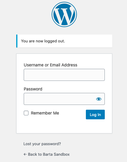
You will then enter your Username or Email Address and Password to log in.
WordPress Dashboard
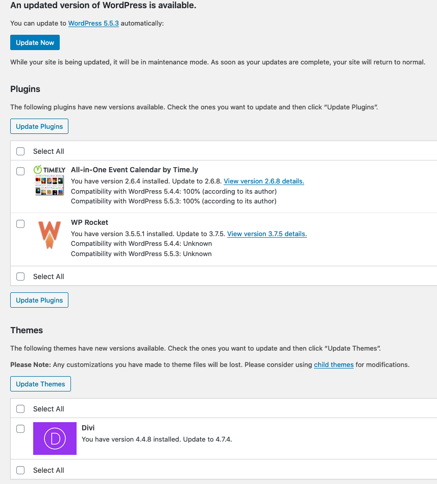
After logging in, you will be brought to the Dashboard. This page gives you a snapshot of your site’s recent activity, updates, and other statuses. If you turn your attention to the left-hand sidebar menu, you’ll see that Dashboard is highlighted. Beneath that, you’ll see two links (Home and Updates). Home simply goes to the Dashboard page. Updates takes you to a page that allows you to update your site’s Plugins, Theme, and WordPress Version.

How To Make Updates to Your Site
The safest way to make updates on your site is to first update your Plugins, followed by your Theme, and lastly your WordPress Version. Keep in mind that you won’t always have updates for all three. But if you do, make sure you update them in this order.
Important Note: It’s always a good idea to ask your hosting company or site administrator to take a backup of your website before updating your site’s WordPress Version or major plugins like WooCommerce. There’s always a small chance that updating these can break your site. So, it’s good practice to have a recent backup ready to go just in case.
Creating & Managing Blog Posts
Proceeding down the sidebar menu, the next item is Posts. This is where you manage your site’s blog posts. You can create a new post by clicking the Add New button that appears at the top of the page. This will bring you to a page where you can create your new post.

At the top of the page, you will enter the title of your post. Beneath that is the link that the post will use. Next, you’ll see a purple button that says “Use The Divi Builder”. We DO NOT recommend using this for blog posts. Next is the Content Box where you put the text and images you’d like to use for the post. This works very similarly to Microsoft Word.
Two important things to note about the Content Box is the Add Media button and the Text Selector.
Adding Images to Posts
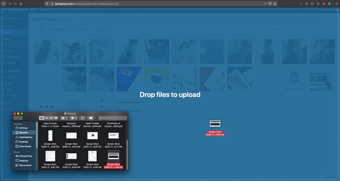
Clicking the Add Media button will open a popup of your Media Library. This shows all the images that have been uploaded to your site. You may upload an image by dragging one from your computer into the library. After its finished uploading, it will be highlighted with a blue checkmark to show that it has been selected.
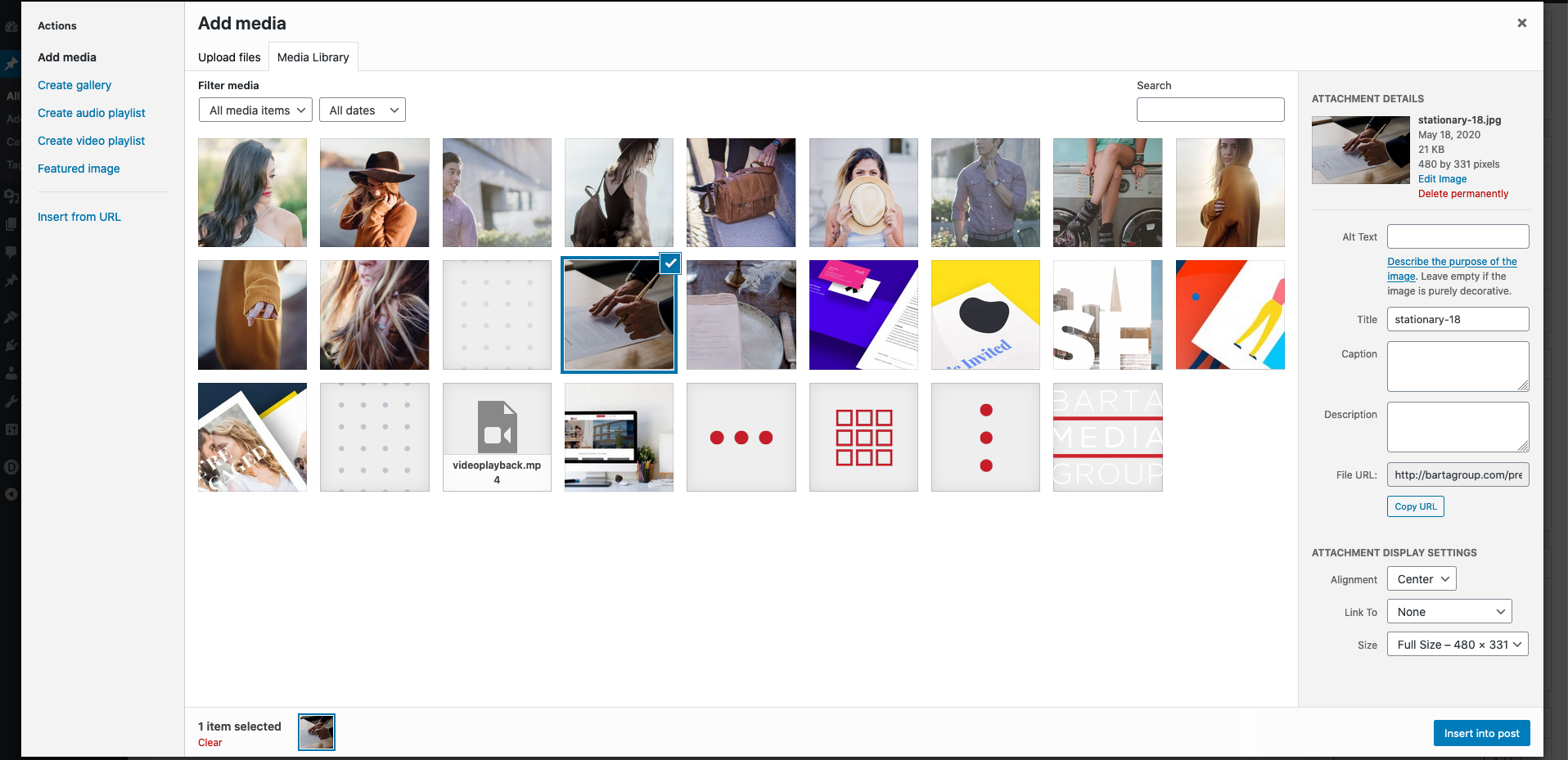
Image Details
On the right-hand side, you will see details about the image followed by display settings. Clicking the Edit Image link will allow you to, crop, flip, rotate or resize the image. Beneath that is the Delete permanently link that will delete the image from the site. You may also add Alt Text, Titles, Captions, and Descriptions to the image.
Image Display Settings
The Display Settings allow you to set the Alignment of the image to Left, Center, Right, or None. You can also have the image Link To the Image File, the Attachment Page, or a Custom URL. Lastly, you can set the Size of the image.
After you’ve entered your desired Details and have selected your Display Settings, you can place it into the post by clicking the blue Insert into post button.
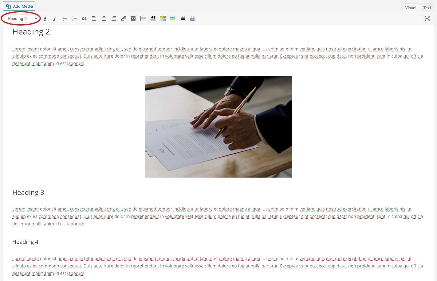
Text Selector
Below the Add Media button is the Text Selector. This allows you to turn text into Headings. Headings are used to organize your content and make it easier to read. It’s important to note that you should not use Heading 1 on any of your text as this will negatively affect the page’s SEO Performance.
Publishing, Categorizing, and Featured Images
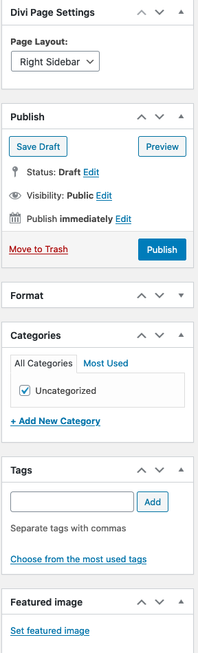
On the right-hand side of the screen, you will see several windows.
- Divi Page Settings: Allows you to move the side menu to the left or right or hide it completely.
- Publish: Allows you to save your post as Draft if you’d like it saved on your site without making it live. Preview your post so that you can see what it will look like on the front-end of the page. Move the post to the Trash if you’d like to delete the post. Publish the post so that it appears on the site.
- Format: You can ignore this window.
- Categories: Allows you to categorize your posts.
- Tags: Allows you to add tags to highlight the topics of the post.
- Featured Image: Allows you to set the main image to use on the post. This is the image that will appear on the blog page at the top of the post and the one that will be shown when the post is shared on social media.
Once you’re ready for your post to go live, click the Publish button. Then you can click the View Post link in the top left portion of the page to view the post on the front-end.
Managing Post Categories & Tags
To manage your post categories, click the Categories link in the Posts submenu on the left side of the screen. This page allows you to add, edit, and delete categories as well as create Parent Categories. The Tags page works very similarly to the Categories page.

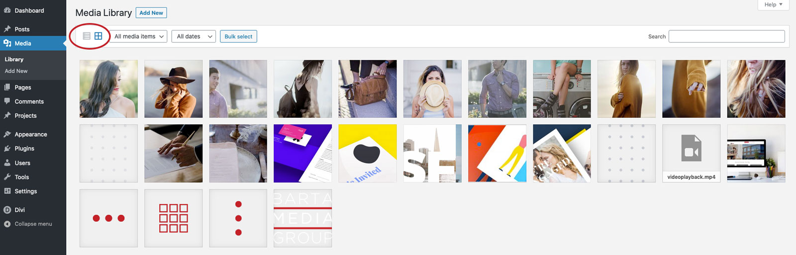
Media Library
The Media Library is where all of your site’s media is stored (e.g., images, PDFs, and videos). You can view your media in the form of a grid or as a list by clicking either the Grid or List icons in the top left corner. Grid view makes it easy to view your media and edit them individually, while List view makes it easier to edit multiple pieces of media at the same time.
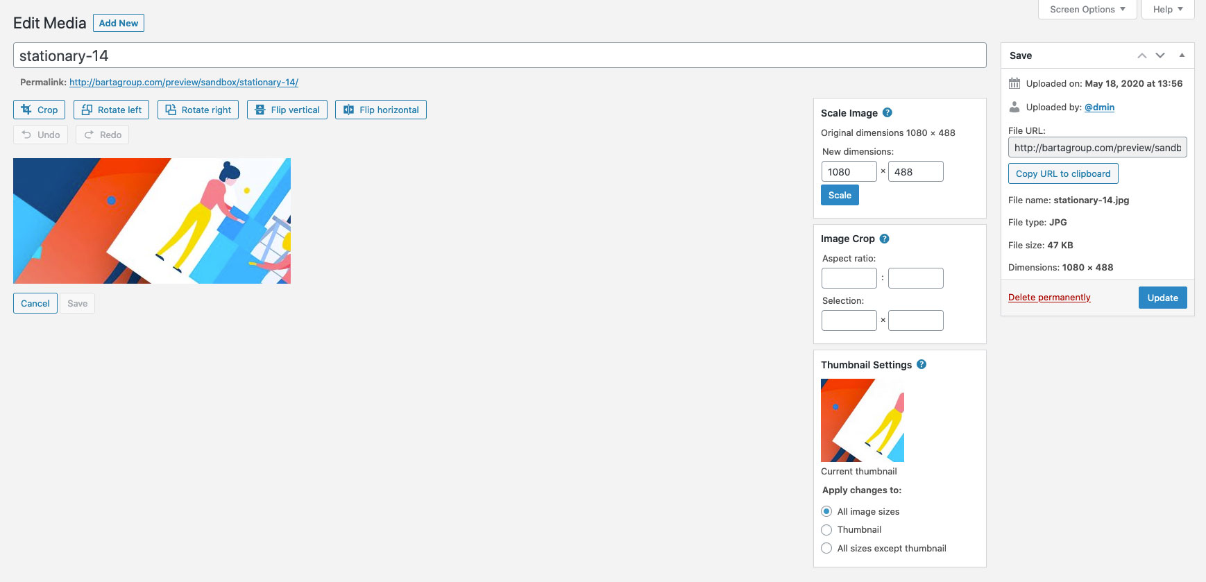
Editing Images
You can edit images by selecting one while in the Grid view or by hovering over it while in the List view and clicking the Edit button. This will bring you to the Edit Media page. To edit the image, click the Edit Image button that appears below the image. Here you can scale down the image to make it smaller, crop it, rotate it, or flip it. It’s a pretty simple editing tool and should cover most of your basic image editing needs. Once you’re finished, click the Update button to save your changes.
Adding Media
To add media to the Media Library, simply click and drag the piece of media you’d like to upload into the Media Library.
Pages
The Pages tab is where all of your site’s pages are stored. You will see your pages listed in alphabetical order. Just like posts, you can open a page to edit it by clicking on the page name. But unlike posts, your page’s content will be controlled by the Divi Builder tool.
Divi Builder
The easiest way to use the Divi Builder is to click on the light blue Build On The Front End button to open the Visual Builder. As a side note, you can also go into the Visual Builder when viewing a particular page on the front end of your site while you’re logged in and clicking the Enable Visual Builder button on the top toolbar.
Using the Divi Visual Builder
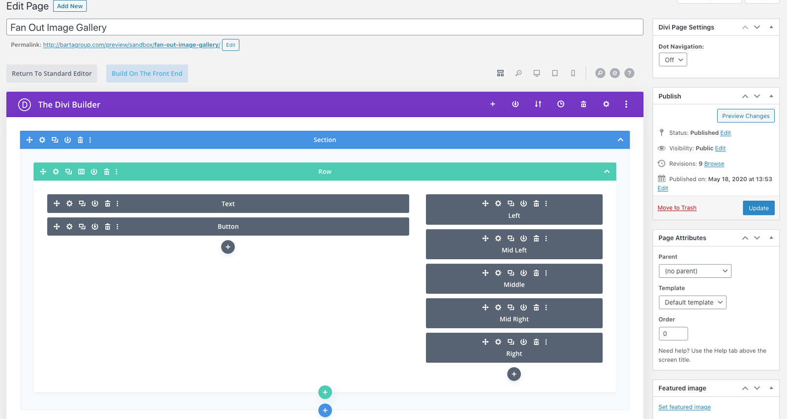
The first thing to understand when working in the Visual Builder is its levels of organization, which are:
- Sections
- Rows
- Modules
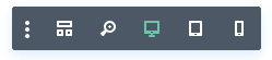
Understanding the Primary Menu Icons
There are 6 menu icons to be aware of when using the Divi Visual Builder.
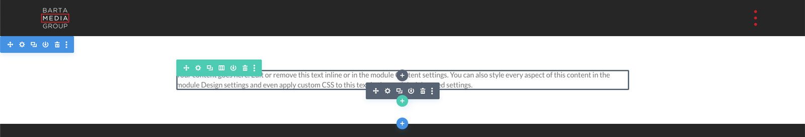
Cross Arrows: Allows you to move the section, row, or module around the page. Note that rows must be placed within sections and modules must be placed within rows. You can have multiple rows within a single section and multiple modules within a single row.
Gear: Opens the settings options
Rectangle: Creates a duplicate of the section, row, or module.
Downward Arrow: Saves the section, row, or module to the Divi Library. This can make it easier to add the same section, row, or module to multiple pages.
Trashcan: Deletes the section, row, or module.
Three Dots: Opens the advanced menu.
Sections
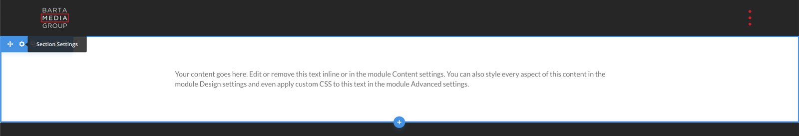
Sections are the blue boxes that surround both the rows (green) and modules (grey). To learn more about how sections work, open the Section Settings by placing your mouse cursor within the section and clicking the Gear icon that appears inside the blue tab in the left-hand corner.
Section Settings
The Section Settings is organized into three tabs:
- Content
- Design
- Advanced
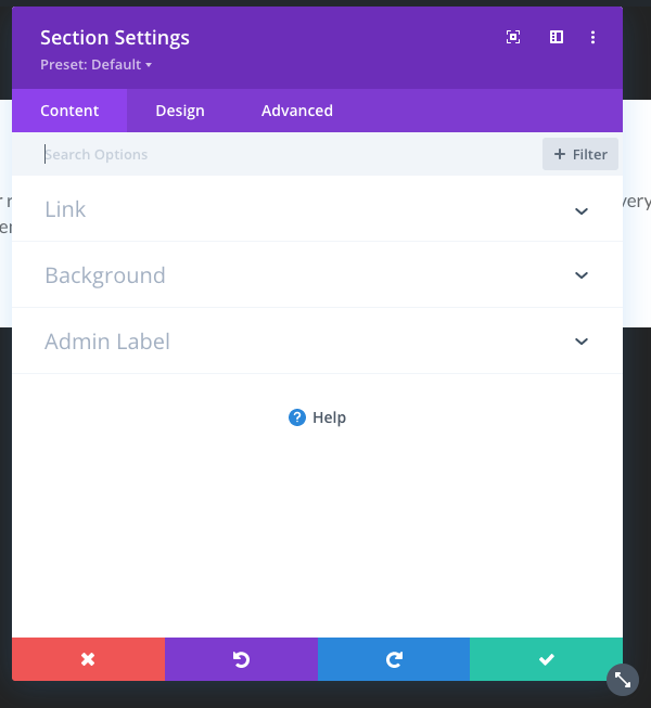
Section Content
Within the section content tab, you have:
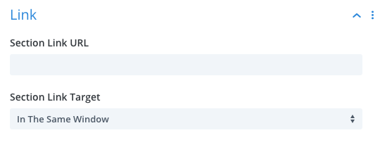
Link: Allows you to link the entire section to a URL (not often used).
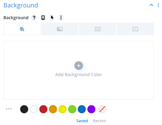
Background: Allows you to set a background color, gradient, image, or video for the section.
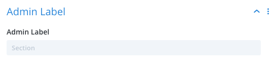
Admin Label: Allows you to label the section for better organization.
Section Design
Within the section design tab, you have:
Layout: Allows you to enable Show Inner Shadow. Doing so creates a light shadowing effect around the section.
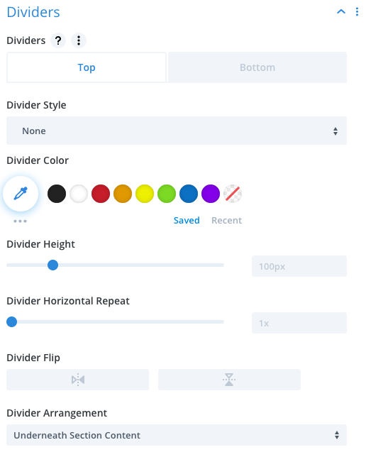
Dividers: Allows you to place dividers above and below your section to create stylistic separation between sections.
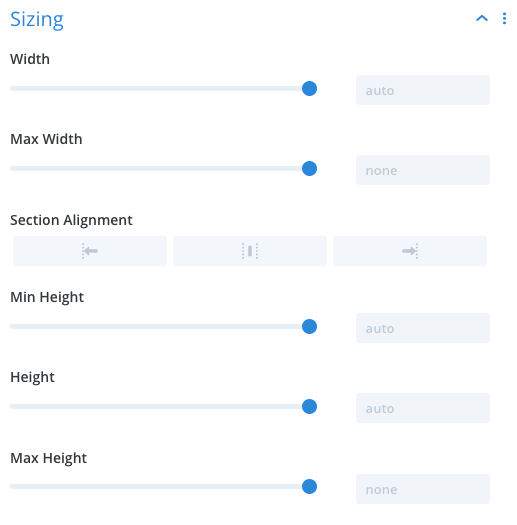
Sizing: Allows you to change the width, height, and section alignment of the section.
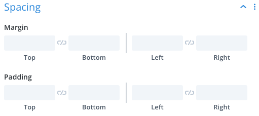
Spacing: Allows you to add Margin (creates space around the section) and Padding (creates space within the section).
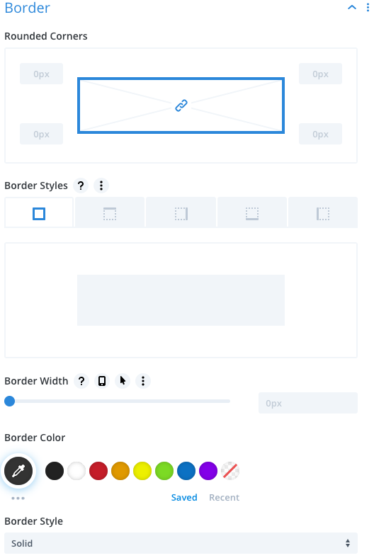
Border: Allows you to add a border around the section.
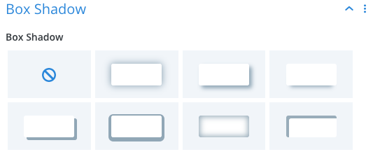
Box Shadow: Allows you to add a shadow effect within or around the section.
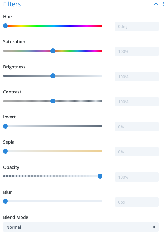
Filters: Allows you to add color filters to the section.
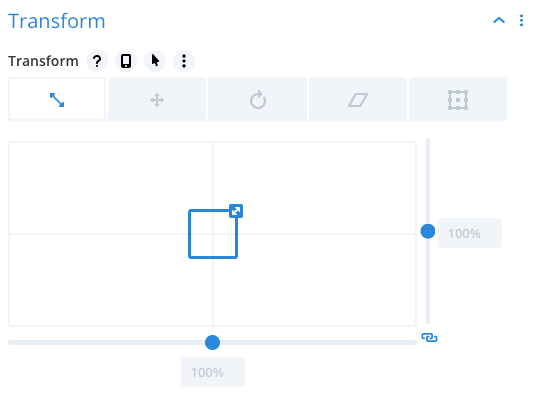
Transform: Allows you to add a variety of transform effects to the section. For a better understanding of how these features work, check out this video.
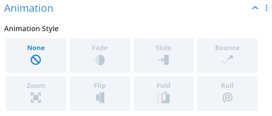
Animation: Allows you to use a variety of animation styles on the section.
Advanced Section Settings
Within the Advanced tab, you have:
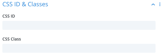
CSS ID & Classes: Allows you to add custom classes and IDs to the section. (Primarily for people who know a little bit about coding).
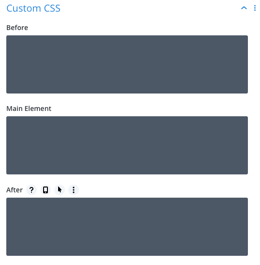
Custom CSS: Allows you to add custom CSS to the section. (Primarily for people who know a little bit about coding).
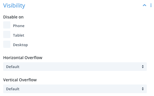
Visibility: Allows you to disable a section on either Phone, Tablet, or Desktop view.
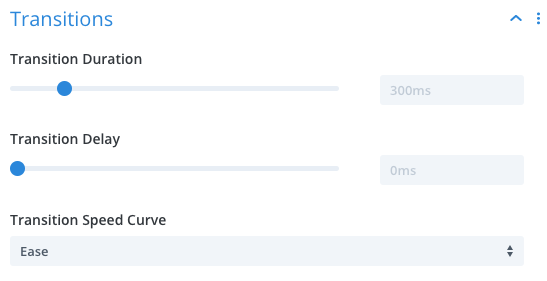
Transitions: Allows you to edit the duration of animations.
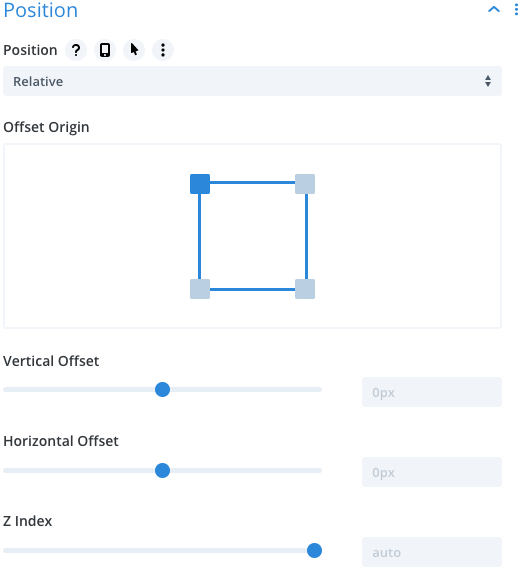
Position: Allows you to change the position of the section. (Primarily for people who know a little bit about coding).
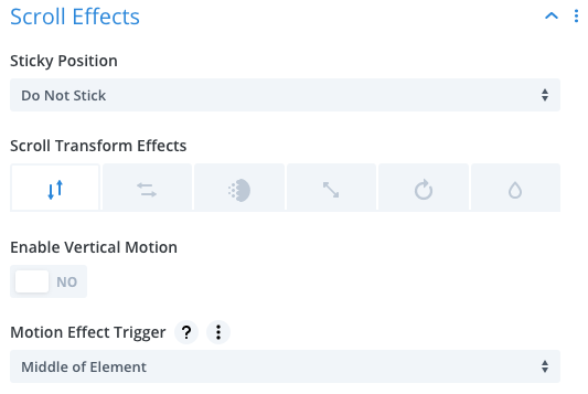
Scroll Effects: Allows you to add a variety of scroll effects to the section. For a better understanding of how these features work, check out this video.
Specialty & Fullwidth Sections
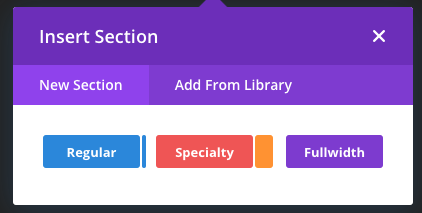
In addition to Regular Sections, you can also add Specialty or Fullwidth sections. The Specialty Sections offer a different variety of section and row layouts.
Fullwidth sections allow you to create sections that display content that extends the full width of the page.
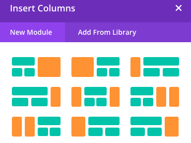
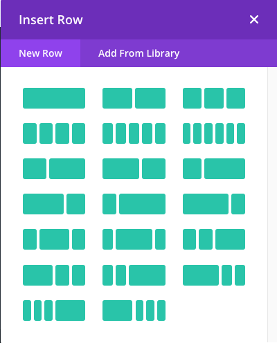
Rows
Rows show up as green rectangles that are held within the borders of the blue section and surround the grey module boxes. Rows can be set to use several different layouts using 1 to 6 columns.
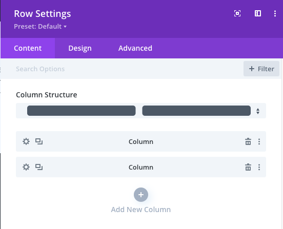
Row Settings
Row settings are very similar to the section settings with a few exceptions.
Row Column Structure
Appearing at the top of the Content tab, Column Structure allows you to change the column structure of the row or add/delete columns by clicking either the plus or trashcan icon. You can also duplicate columns by clicking the rectangle icon or change certain settings within an individual column by clicking the gear icon.
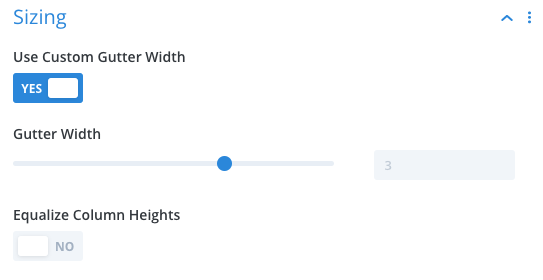
Row Sizing
Within the Sizing menu of the Design Tab, you will see two additional options that do not appear in the regular section sizing menu.
Use Custom Gutter Width: Allows you to change the amount of space between columns.
Equalize Column Heights: Allows you to force all columns to assume the height of the tallest column in the row. All columns will have the same height to keep a uniform appearance.
Modules
Modules are the grey boxes that appear within the green rows. There are many different modules to pick from that serve different purposes. For an overview of what each module does, check out this video.
Editing Module Content
To edit a module’s content, click the gear icon to open the module’s settings. Most module content settings are pretty straightforward. You’ll see fields with labels that tell you what content you’re editing. Modules that use body text use a simple word processor that works very similar to Microsoft Word and similar software.
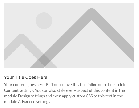
Some modules will use images or icons as part of their features. Let’s explore these settings using the Blurb Module as an example.
Example: Blurb Module
Blurb Content Settings
Text: The first option menu you will see is labeled Text. This shows you where you can edit the blurb title and the body text.
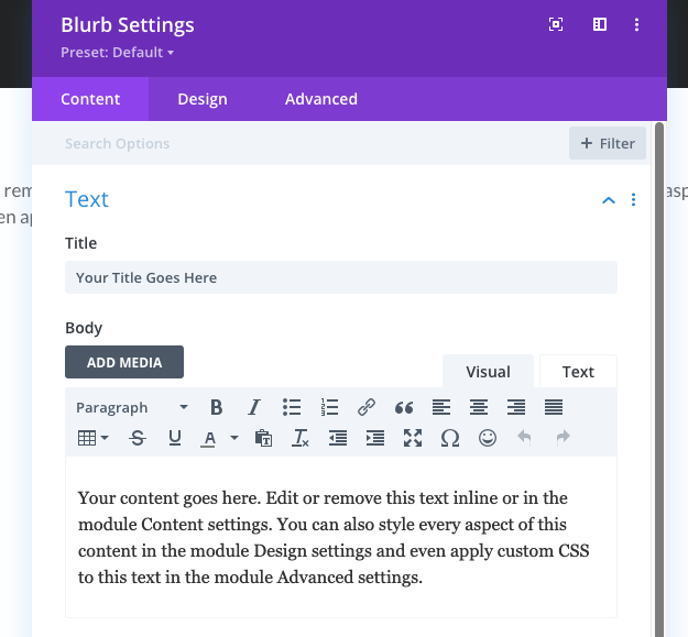
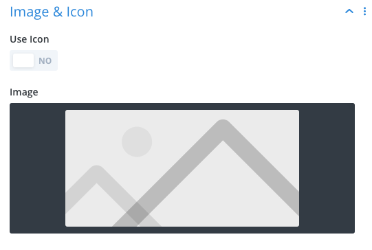
Image & Icon: This menu allows you to add an image from your image library or use one of the hundreds of icons that are part of the Divi database.
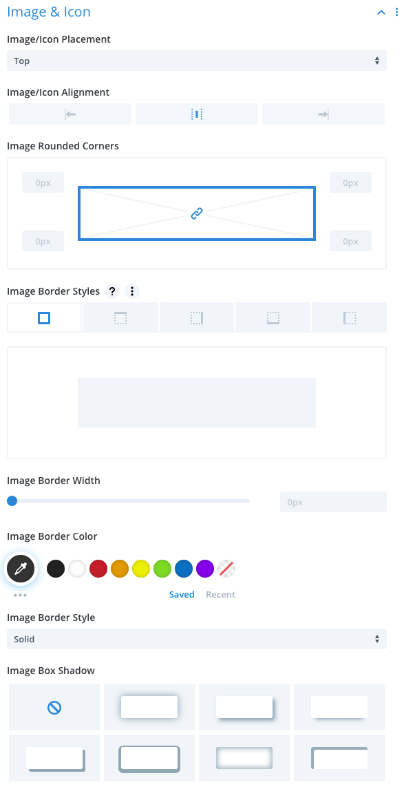
Blurb Design Options
Within the Design tab, you will see several new design menus that you didn’t see in either the row or section settings.
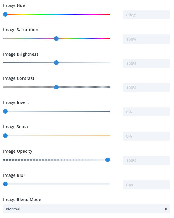
Image & Icon: Allows you to change a variety of display settings related to the blurb image.
Text: Allows you to change the alignment of text, change the color to dark or white, and adding a shadow effect.
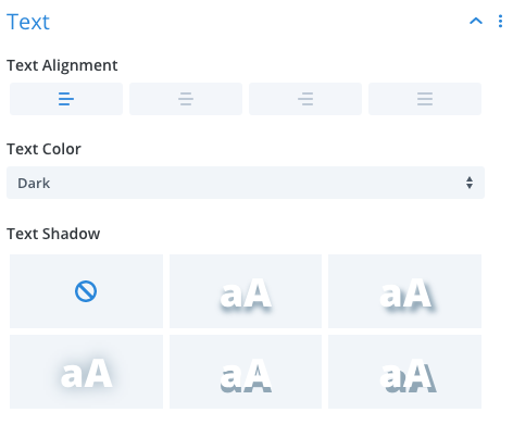
Title Text: Allows you to change the design of the Title Text in a variety of ways.
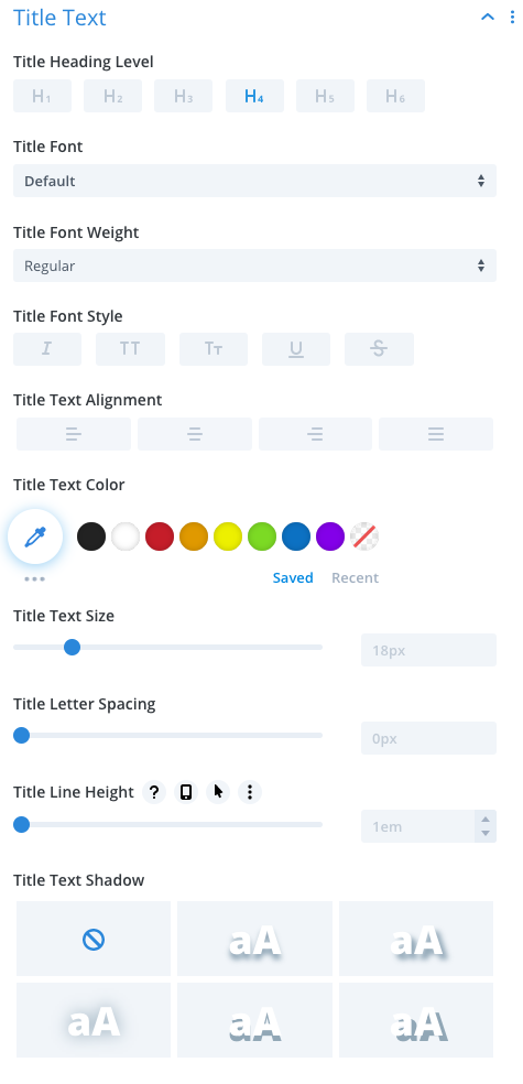
Body Text: Uses the same options that appear in the Title Text settings but affects the body text.
The remaining customization options are very similar to what you’ve seen in the section and row setting options.
Saving Changes
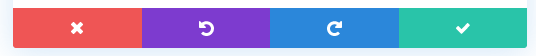
Once you’re finished making your changes, click the Green Checkmark button that appears in the bottom right corner to save your changes. Here you will also see the Purple Undo button that will allow you to undo changes you’ve made, the Blue Redo button for when clicking the Undo button too many times, and the Red Discard All Changes button that will close the settings menu without applying any of the changes you made to the module.
Saving Pages
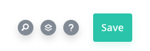
To save an entire page you’ve made changes on, first, open the page menu by clicking the Purple 3 Dot Icon at the bottom of the page.

Then click the Green Save button that appears in the bottom right-hand corner.
Editing for Tablet and Mobile View
Another important part of the Divi Builder is the Responsive Design Editing feature. To get the best use out of this tool, go to the bottom left corner of the screen with the Page Settings Menu open and click on either the Tablet or Mobile device icon.
This will shrink the window to the average width of most tablet or mobile devices so that you can see what the page will look like when appearing on those sized devices.
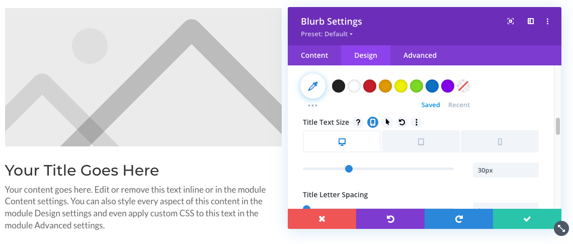
One of the most common uses for the Responsive Editor is to shrink heading text when it appears on smaller devices. To enable the Responsive Editor, open the design element you’d like to edit and hover your mouse over the label. We’ll use the Title Text Size in the Blurb Module as an example.
Click the gear icon to open the Blurb Settings, then go to the Design tab and then to the Title Text option. When hovering over the Title Text Size label, you’ll see an icon appear that looks like a smartphone. Click the icon to open the Responsive Editor. Now you can cycle through the Desktop, Tablet, and Mobile view for this specific design element.
Title Text Size for Desktop View = 30px
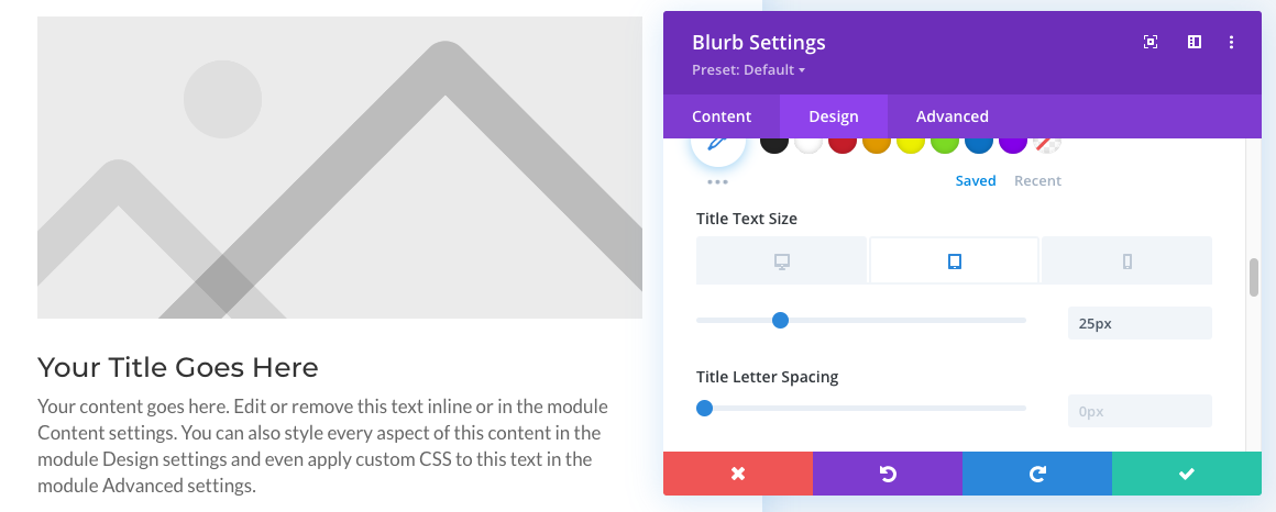
Title Text Size for Tablet View = 25px
Title Text Size for Mobile View = 20px
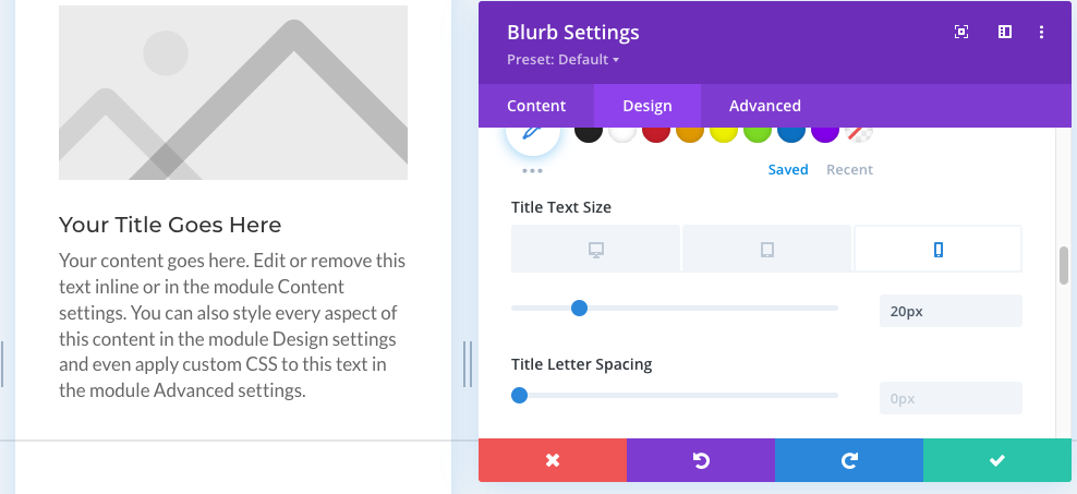
As you can see from the above three screenshots, only the size of the Title Text was affected by these changes. Almost every design and content option within a Section, Row, and Module can have the Responsive Editor enabled, offering a wide range of customization options.
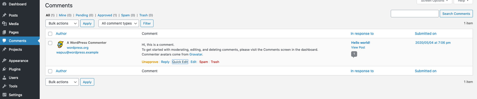
Comments
Moving back over to the backend of the site, let’s briefly cover the Comments tab. If you are running an active blog that has a lot of community engagement or if it’s an e-commerce website and you want to display customer reviews, Comments makes it easy for visitors to share their thoughts with you.
Whenever someone posts a comment or review to your site, you’ll see a notification in the Comments tab. This allows you to review the comment and either approve it, delete it, or mark it as spam. You can also reply to comments to keep the conversation going.
However, if you’re not looking to have visitors leave comments or reviews on your site, it’s best just to turn them off to avoid your site getting a lot of spam messages. This can be done in the Settings tab.
Projects
Projects work very similar to Pages and Posts and can use the Divi Builder. If your website has a portfolio, this is where you can store those pages.
Appearance
The Appearance tab is where some of your site’s more delicate information is stored. This includes:
Themes: Shows you what themes you have installed on your site.
Customize: Allows you to make a variety of customizations to your theme.
Widgets: Allows you to customize a variety of widgets on your site. (This feature is not often used anymore.)
Menus: Allows you to edit the navigation links that appear in the header and footer of your site.
Background: Allows you to change the background color or image of the site. (This feature is not often used anymore.)
Theme Editor: Where all of your site’s most sensitive code is stored. (Not recommended unless you are a skilled developer.)
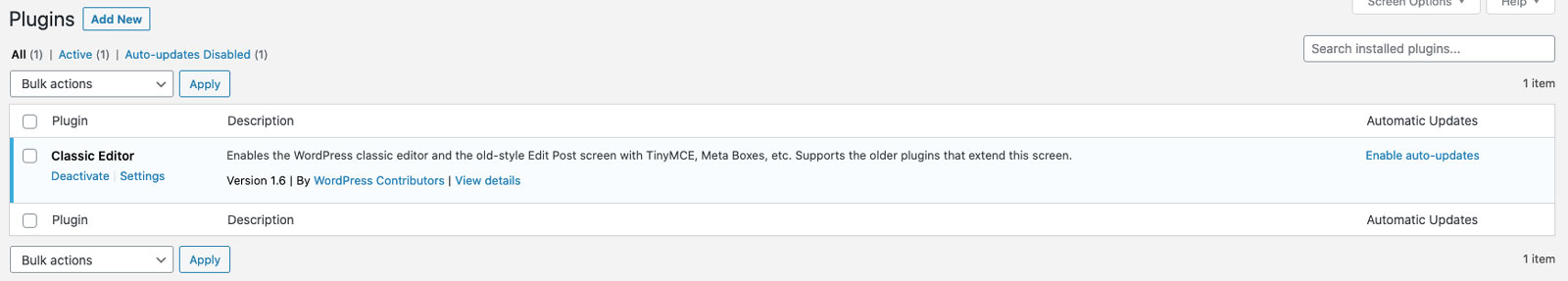
Plugins
The Plugins tab is where all of your site’s plugins are stored. Here you can update, deactivate, remove, edit, and add new plugins to your site.
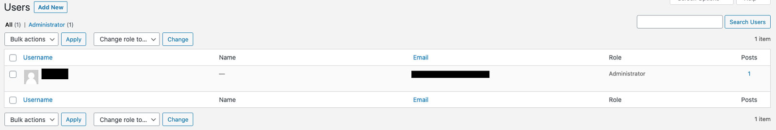
Users
The Users tab is where you can manage all of the users that have access to the backend of your website.
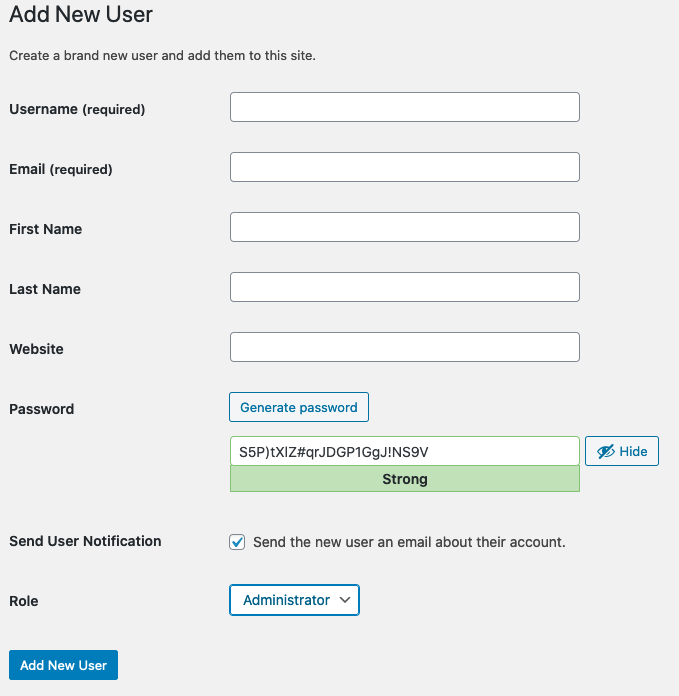
Add A New User
To add a new user to your site, click the Add New button that appears in the top left corner.
All that is required to add a new user is to enter a username and email address. Then you can select the Role that you’d like the user to have. To learn more about the differences between these roles, check out this post. It doesn’t matter what you set the initial password as since the new user will have the opportunity to set their password the first time they log into the site.
Once you’re finished, click the Add New User button.
Tools
The Tools tab is primarily for more advanced users and is generally not very useful for the average user.
Settings
The Settings tab is primarily for more advanced users and site administrators and is generally not very useful for the average user.
Divi Theme Options
Inside the Divi Theme Options tab, there are a lot of additional customization options available. For this guide, we’re not going to cover these options as they are primarily for more advanced users.
This concludes our guide for managing your WordPress site with Divi. Hopefully, this gave you a good overview of how the platform works. If you have any further questions, we recommend contacting your site’s administrator for assistance.