
Addressing your website’s pain points can help you streamline your conversion funnel and prevent losing potential customers. Below are some of the biggest reasons users leave a website. If you find that your website is losing a large number of visitors, it may be wise to perform an audit of your site and make sure you are not making any of these mistakes.
What is User Drop-off
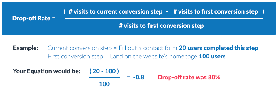
Before diving into how to prevent user drop-off, it’s important to understand exactly what it entails and how it differs from bounce rate. User drop-off is calculated by taking the number of visits to the current conversion step (example: clicking to a contact form) minus the number of visits from the first conversion step (example: visitors to your homepage) all divided by the number of visits from your first conversion step.
User Drop-off vs. Bounce Rate
The bounce rate consists of the number of users who immediately leave your site or hit the back button after they arrived. Google considers these users to be those that stay on your site for only a couple of seconds. Some of the main reasons users bounce from a site include slow load speed, non-responsive design on a mobile device, confusing navigation, or an outdated look.
Top Mistakes That Lead to User Drop-Off
1. Poor Call-to-Actions
The most common mistake I see that causes user drop-off is a lack of strong call-to-actions (CTAs). This is a major mistake since CTAs are arguably the most important element on a website. Whether you’re selling products directly on your site, wanting users to inquire about your services, or running a blog, getting users to the end of your sales funnel is the ultimate goal of any website. And without effective CTAs, this is likely to fail. Call-to-actions can take several forms:
- Phone number
- Contact form
- Checkout
- Download
- Video
- Quote request
- Links to more information
Once you know the CTAs you’ll be using, the next thing you need to consider is their placement on the site. As a general rule, your most important CTAs should be placed at the very top of your design hierarchy. This makes them easy to find and smooths out the user experience. Online users have a very short attention span, so keep that in mind when creating your design hierarchy.
You also want to avoid overwhelming your users with too many CTAs. See the figure below as an example of “Good” and “Bad” CTA distribution.
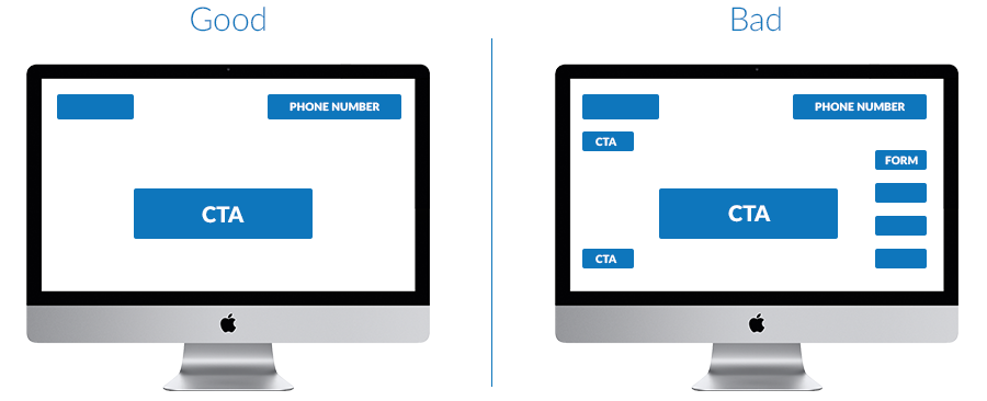
Simplifying your user’s decision-making is key. The fewer decision a user has to make, the faster you can get them to the end of your sales funnel. Ideally, you want one to two CTAs present on a page at any given point.
2. Confusing Navigation
Another thing to consider is how easily users are able to navigate your website. When designing your navigation one of the first things to consider is the demographics of your online users. For instance, will your audience be familiar enough with modern web design trends that they’ll know how to use a collapsible or hamburger navigation? Another thing you should consider is how clearly labeled your navigation links are. If a user clicks a link, is it going to take them to where they expected to go?
Simple Navigation

Just like with your CTAs, you don’t want to have too many links crowding your navigation. Dropdowns and mega menus, for instance, are an effective way to simplify your navigation while still providing your users with plenty of navigation options.
Mega Menu

Using an on-page navigation is another consideration worth thinking about. These are navigation menus that appear within the body of a given page. These are good for pages that contain a lot of content or can be applicable to several pages that fall under a particular category.
On-Page Navigation

However you decide to structure your website’s navigation, make sure it’s designed with the goal of getting your users to where they need to go.
3. Ineffective Contact Forms
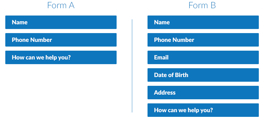
Another common cause of user drop-off is poorly designed contact forms. With contact forms, there’s an important balance that needs to be struck. Asking for too much or too personal of information upfront can dissuade many users from finishing the form. The best contact forms are those that ask for information that users can readily give while avoiding to ask for more information than is needed. Just ask yourself, which of the two forms below would you be more inclined to fill out?
4. Inaccessible Contact Information
I’ll keep this last one short. If phone calls are your primary way of doing business, then your phone number should be visible on every page and make sure it’s “click-to-call.” If you prefer to communicate with your users through social media, make the links to your social pages very apparent. If you can’t afford to be bombarded with calls and direct messages, use a contact form that goes directly to your email.
The point here is to make it as easy as possible for customers to get in touch with you. No one wants to spend minutes on your site trying to get in touch with you.